Bootstrap Table
Overview
Tables are presented in most applications (web, desktop or mobile application) and they are a key element in presenting data to the end user.
Today, with the importance that the user interface has, knowing how to enhance the appearance of a table becomes as relevant as it is. In this scenario, one of the technologies that has become reference is Bootstrap. This front-end framework, among many other features, provides a number of features for styling and optimizing the display of various components, such as table.
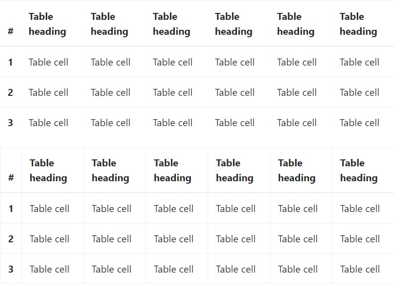
Main table in Bootstrap
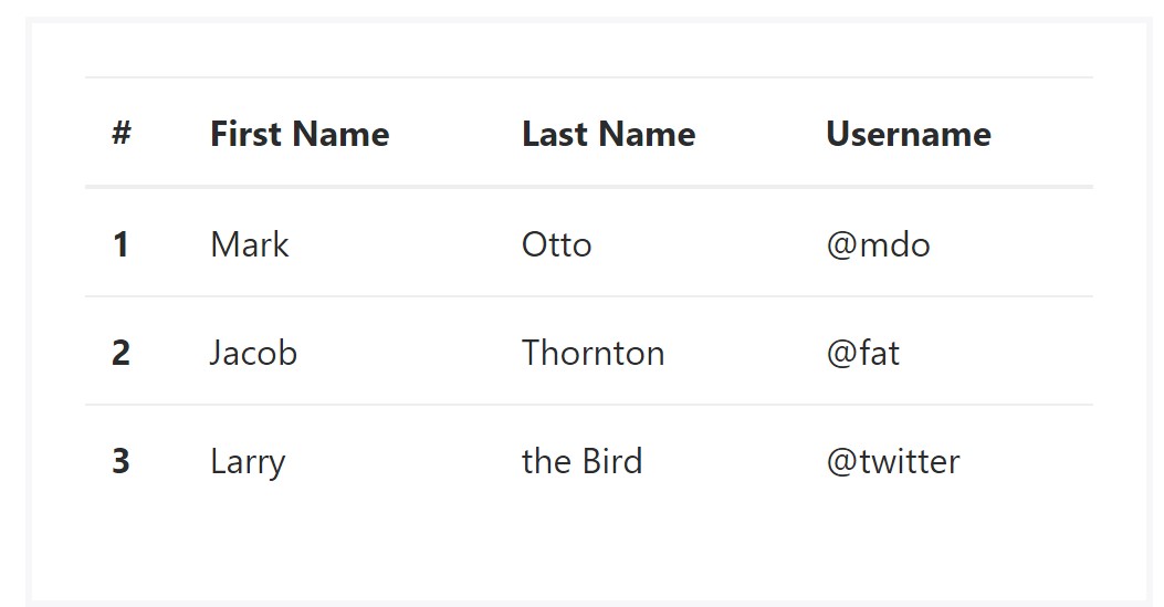
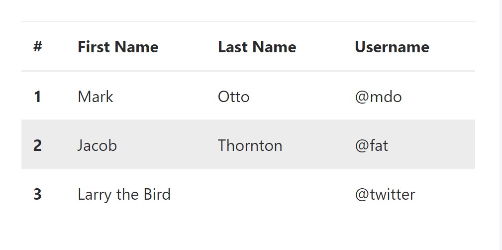
To style a table with Bootstrap, simply add the table class to the <table> tag, and some visual formatting will already be applied, as displayed on the screenshot .
<table class="table">
  <thead>
    <tr>
      <th>#</th>
      <th>First Name</th>
      <th>Last Name</th>
      <th>Username</th>
    </tr>
  </thead>
  <tbody>
    <tr>
      <th scope="row">1</th>
      <td>Mark</td>
      <td>Otto</td>
      <td>@mdo</td>
    </tr>
    <tr>
      <th scope="row">2</th>
      <td>Jacob</td>
      <td>Thornton</td>
      <td>@fat</td>
    </tr>
    <tr>
      <th scope="row">3</th>
      <td>Larry</td>
      <td>the Bird</td>
      <td>@twitter</td>
    </tr>
  </tbody>
</table>
Inverse tables.
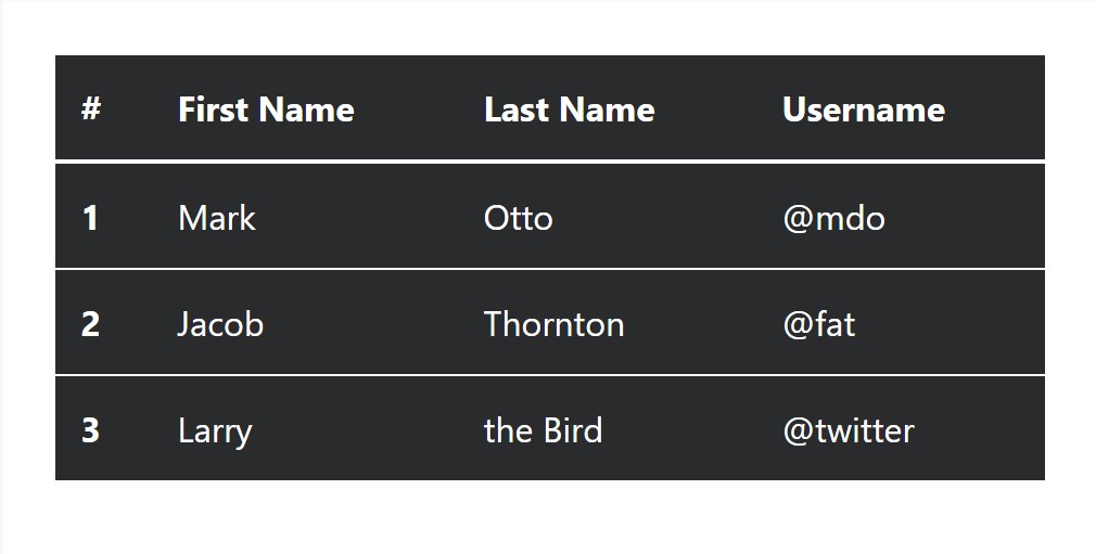
Among the latest tables in Bootsrap 4 is the inverse tables. Class .table-inverse can easily change the coloration of the table.
<table class="table table-inverse">
  <thead>
    <tr>
      <th>#</th>
      <th>First Name</th>
      <th>Last Name</th>
      <th>Username</th>
    </tr>
  </thead>
  <tbody>
    <tr>
      <th scope="row">1</th>
      <td>Mark</td>
      <td>Otto</td>
      <td>@mdo</td>
    </tr>
    <tr>
      <th scope="row">2</th>
      <td>Jacob</td>
      <td>Thornton</td>
      <td>@fat</td>
    </tr>
    <tr>
      <th scope="row">3</th>
      <td>Larry</td>
      <td>the Bird</td>
      <td>@twitter</td>
    </tr>
  </tbody>
</table>
Additional classes
There are also some classes that allow you to apply a different styles to a table, they are::
<table class="table-striped"> Toggles the color of table rows
<table class="table-bordered"> Adds border to the table;
<table class="table-hover"> Activates the highlight of a line when we hover the mouse cursor over it;
<table class="table-condensed"> Reduces the height of table rows, making it more compact.
To apply these styles, simply add the desired classes to the <table>: <table class="table table-striped table-bordered table-condensed table-hover">
Table head opportunities
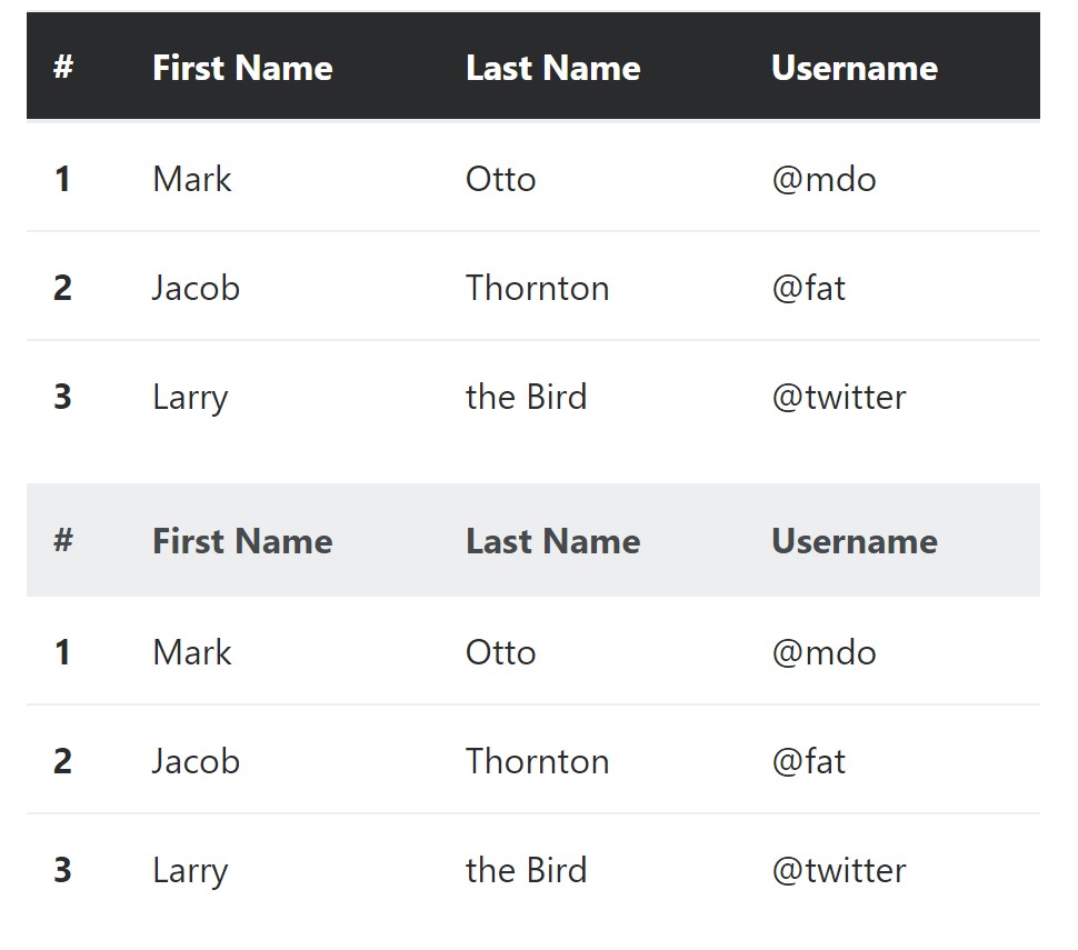
Much like default and inverse tables, run one of two modifier classes to make <thead> appear dark or light gray.
<table class="table">
  <thead class="thead-inverse">
    <tr>
      <th>#</th>
      <th>First Name</th>
      <th>Last Name</th>
      <th>Username</th>
    </tr>
  </thead>
  <tbody>
    <tr>
      <th scope="row">1</th>
      <td>Mark</td>
      <td>Otto</td>
      <td>@mdo</td>
    </tr>
    <tr>
      <th scope="row">2</th>
      <td>Jacob</td>
      <td>Thornton</td>
      <td>@fat</td>
    </tr>
    <tr>
      <th scope="row">3</th>
      <td>Larry</td>
      <td>the Bird</td>
      <td>@twitter</td>
    </tr>
  </tbody>
</table>

<table class="table">
  <thead class="thead-default">
    <tr>
      <th>#</th>
      <th>First Name</th>
      <th>Last Name</th>
      <th>Username</th>
    </tr>
  </thead>
  <tbody>
    <tr>
      <th scope="row">1</th>
      <td>Mark</td>
      <td>Otto</td>
      <td>@mdo</td>
    </tr>
    <tr>
      <th scope="row">2</th>
      <td>Jacob</td>
      <td>Thornton</td>
      <td>@fat</td>
    </tr>
    <tr>
      <th scope="row">3</th>
      <td>Larry</td>
      <td>the Bird</td>
      <td>@twitter</td>
    </tr>
  </tbody>
</table>
Striped rows
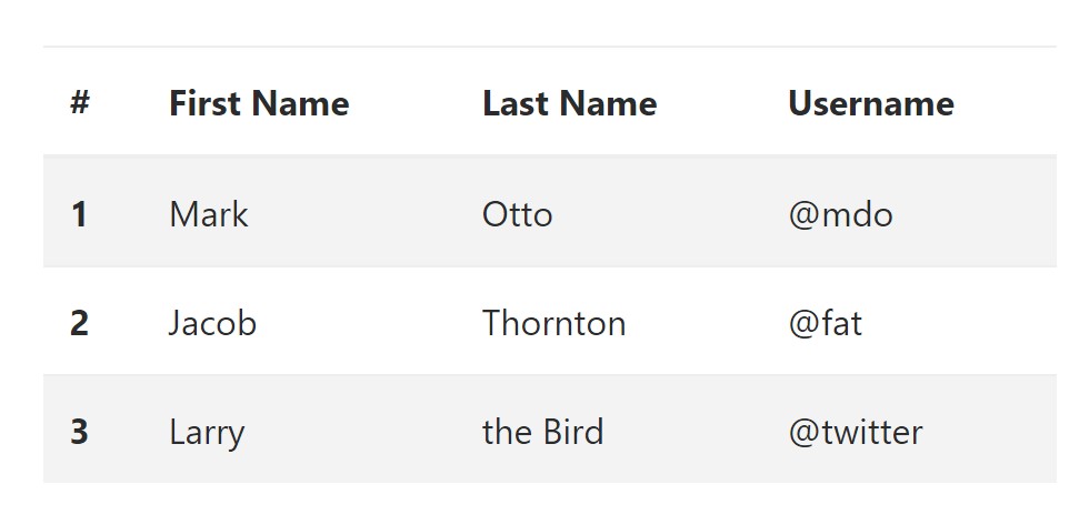
Zebra-like stripes may be incorporated with the .table-striped class, an example
<table class="table table-striped">
  <thead>
    <tr>
      <th>#</th>
      <th>First Name</th>
      <th>Last Name</th>
      <th>Username</th>
    </tr>
  </thead>
  <tbody>
    <tr>
      <th scope="row">1</th>
      <td>Mark</td>
      <td>Otto</td>
      <td>@mdo</td>
    </tr>
    <tr>
      <th scope="row">2</th>
      <td>Jacob</td>
      <td>Thornton</td>
      <td>@fat</td>
    </tr>
    <tr>
      <th scope="row">3</th>
      <td>Larry</td>
      <td>the Bird</td>
      <td>@twitter</td>
    </tr>
  </tbody>
</table>
Hover Rows
To make a hover side effect in the rows of your table add in the .table-hover class:
<table class="table table-hover">
  <thead>
    <tr>
      <th>#</th>
      <th>First Name</th>
      <th>Last Name</th>
      <th>Username</th>
    </tr>
  </thead>
  <tbody>
    <tr>
      <th scope="row">1</th>
      <td>Mark</td>
      <td>Otto</td>
      <td>@mdo</td>
    </tr>
    <tr>
      <th scope="row">2</th>
      <td>Jacob</td>
      <td>Thornton</td>
      <td>@fat</td>
    </tr>
    <tr>
      <th scope="row">3</th>
      <td colspan="2">Larry the Bird</td>
      <td>@twitter</td>
    </tr>
  </tbody>
</table>
Bordered Table
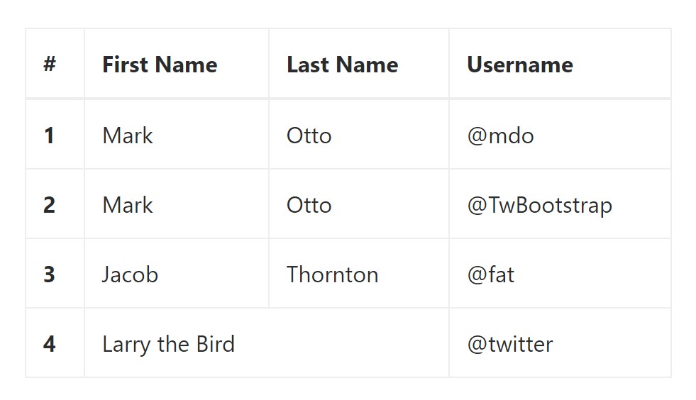
You can surely bring in the borders on the every single table slide and a cell with the .table-bordered class:
<table class="table table-bordered">
  <thead>
    <tr>
      <th>#</th>
      <th>First Name</th>
      <th>Last Name</th>
      <th>Username</th>
    </tr>
  </thead>
  <tbody>
    <tr>
      <th scope="row">1</th>
      <td>Mark</td>
      <td>Otto</td>
      <td>@mdo</td>
    </tr>
    <tr>
      <th scope="row">2</th>
      <td>Mark</td>
      <td>Otto</td>
      <td>@TwBootstrap</td>
    </tr>
    <tr>
      <th scope="row">3</th>
      <td>Jacob</td>
      <td>Thornton</td>
      <td>@fat</td>
    </tr>
    <tr>
      <th scope="row">4</th>
      <td colspan="2">Larry the Bird</td>
      <td>@twitter</td>
    </tr>
  </tbody>
</table>
Condensed Table
If you wish to make your table more compact - you can easily cut cell padding in half with this class: .table-condensed.
Take note that, while Bootstrap 4 uses .table-sm to condense a table, Bootstrap 3 uses .table-condensed. Each cut cell padding in half.
<table class="table table-sm">
  <thead>
    <tr>
      <th>#</th>
      <th>First Name</th>
      <th>Last Name</th>
      <th>Username</th>
    </tr>
  </thead>
  <tbody>
    <tr>
      <th scope="row">1</th>
      <td>Mark</td>
      <td>Otto</td>
      <td>@mdo</td>
    </tr>
    <tr>
      <th scope="row">2</th>
      <td>Jacob</td>
      <td>Thornton</td>
      <td>@fat</td>
    </tr>
    <tr>
      <th scope="row">3</th>
      <td colspan="2">Larry the Bird</td>
      <td>@twitter</td>
    </tr>
  </tbody>
</table>
Contextual Classes
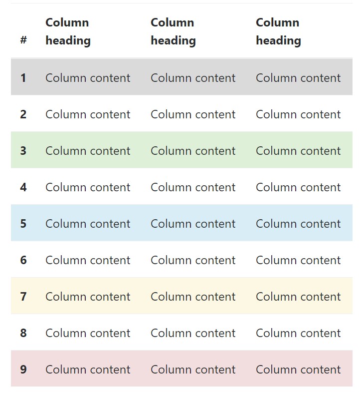
Use the contextual classes to color a table cells (<td>) and table rows (<tr>):
<!-- On rows -->
<tr class="table-active">...</tr>
<tr class="table-success">...</tr>
<tr class="table-warning">...</tr>
<tr class="table-danger">...</tr>
<tr class="table-info">...</tr>

<!-- On cells (`td` or `th`) -->
<tr>
  <td class="table-active">...</td>
  <td class="table-success">...</td>
  <td class="table-warning">...</td>
  <td class="table-danger">...</td>
  <td class="table-info">...</td>
</tr>
Changing the rows of a table Bootstrap 3 does not use the .table- prefix for its contextual classes. Bootstrap 3 uses .active while Bootstrap 4 uses .table-active. Other than that, both of these versions use the exact same 5 contextual keywords (active, success, info, warning, danger). Listed here you can see the information about each of the possible types:
● active: Applies the focus color to the table row or table cell
● success: Indicates a successful or positive action
● info: Indicates a neutral information change or action
● warning: Indicates a warning that you may need attention
● danger: Indicates a dangerous or potentially negative action
Responsive Tables
To create a responsive table - use the .table-responsive class. Table rolls in the horizontal way on gadgets that less than 768px. If the gadget is larger sized than 768px wide, then you will see no difference :
Bootstrap 4 allows you to add the .table-responsive class to the actual <table> element. Bootstrap 3 tables required that you add that class to a parent <div> element.
Examine a number of online video short training relating to Bootstrap tables
Connected topics:
Bootstrap tables: official documentation
W3schools:Bootstrap table tutorial
Bootstrap Tables Lecture
Best Free AI Website Builder
Generate AI websites with a simple prompt!
Type in any language, export in zip.
Best Free Website Builder Software
Create awesome websites offline!
No coding. 9900+ templates.
Edit and save locally, upload wherever.
Free website builder download for Win, Mac, Linux!
Best Website Templates
HTML Business Templates
Web Design HTML Templates
HTML eCommerce Website Template
Hotel HTML Template
Landing Page HTML Template
Premium Design HTML Themes
HTML Resume Template
Online Shopping HTML Template
HTML Responsive Templates
Latest Posts
- AI website creator and generator - how to create a website with AI in just 2 minutes.
- Best Free AI website generator and builder - create a website design with AI.
- Best Website Builder AIBest Free AI Website Builder - Create Website Design with AI
- Best Website Builder for Consultants, Magazines, Churches, Authors
- Best Website Builder for Designers, Videos, Education, Software Companies
- Website Builder for Beginners, Bloggers, Writers, IT Companies
- Best Website Builder for Restaurants, Online Stores, Real Estate, Musicians
- Best Website Builder for podcasts and affiliate marketing
- Therapists and nonprofits Website Builder
- Portfolio and SEO Website Builder
- Website Builder for Kids and Musicians
- Website Builder for Photographers and Artists
- HTML Code Generator - HTML Code Creator
- Web Design Program - Website Design Tool
- Landing Page Generator - Landing Page Builder
- No Coding Website Builder - Website Builder For Small Business
- Innovative HTML Builder Drag And Drop Free for Your Next Project
- Is There A Completely Free QR Code Generator
- Extremely Comfortable Business Website Constructor Review
- Bootstrap Select
- Bootstrap Panel
- Bootstrap Tabs
- Bootstrap Toggle
- Bootstrap Modal Popup
- Bootstrap Row
- Bootstrap Multiselect
- Bootstrap Media queries
- Bootstrap Login Forms
- Bootstrap Layout
- Bootstrap Jumbotron
- Bootstrap Button Group
- Bootstrap Breakpoints
- Bootstrap Navbar
- Bootstrap Tooltip
- Bootstrap Textarea
- Bootstrap Switch
- Bootstrap Slider
- Bootstrap Progress Bar
- Bootstrap Label
- Bootstrap Header
- Bootstrap Clearfix
- Bootstrap Sidebar
- Bootstrap Radio
- Bootstrap Offset
- Bootstrap Menu
- Bootstrap Columns
- Bootstrap Checkbox
- Bootstrap Accordion
- Bootstrap Image
- Bootstrap Grid
- Bootstrap Form
- Bootstrap Glyphicons
- Bootstrap List
- Bootstrap Carousel
- Bootstrap Icons
- Bootstrap Collapse
- Bootstrap Popover
- Bootstrap Input
- Bootstrap Modal
- Bootstrap Pagination
- Bootstrap Button
- Bootstrap Alert