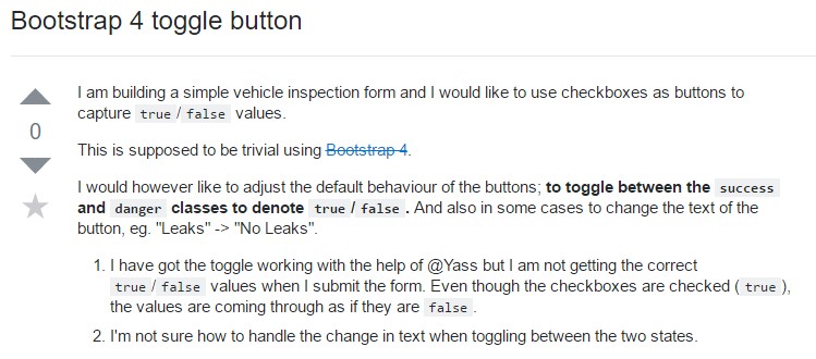
Bootstrap Button
Introduction
The button elements along with the links wrapped inside of them are maybe the most important elements allowing the users to interact with the web pages and take various actions and move from one page to another. Especially now in the mobile first world when at least half of the pages are being viewed from small touch screen devices the large comfortable rectangular areas on screen easy to find with your eyes and touch with your finger are more crucial than ever. That’s why the new Bootstrap 4 framework evolved providing more comfortable experience dropping the extra small button size and adding some more free space around the button’s captions to make them even more legible and easy to use. A small touch adding a lot to the friendlier looks of the new buttons are also a bit more rounded corners which along with the more free space around make the buttons much more pleasing for the eye.
The semantic classes
In this version have the very same number of cool and easy to use semantic styles giving us the capability to relay meaning to the buttons we use with just adding a single class.
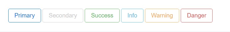
The semantic classes are the same in number as in the last version but with some improvements – the rarely used default button generally carrying no meaning has been dropped in order to get replaced by the more subtle and intuitive secondary button styling so now the semantic classes are:
Primary .btn-primary - colored in mild blue;
Secondary .btn-secondary - replacing the .btn-default class – clean white color with subtle grey outline;
Info .btn-info - a bit lighter and friendlier blue;
Success .btn-success the good old green;
Warning .btn-warning colored in orange;
Danger .btn-danger which comes to be red;
And Link .btn-link which comes to style the button as the default link element;
Just make sure you first add the main .btn class before applying them.

<button type="button" class="btn btn-primary">Primary</button>

<button type="button" class="btn btn-secondary">Secondary</button>

<button type="button" class="btn btn-success">Success</button>

<button type="button" class="btn btn-info">Info</button>

<button type="button" class="btn btn-warning">Warning</button>

<button type="button" class="btn btn-danger">Danger</button>

<button type="button" class="btn btn-link">Link</button>
Tags of the buttons
When ever working with button classes on <a> elements that are used to provide in-page functions (like collapsing content), instead connecting to new webpages or zones inside the existing webpage, these web links should be granted a role="button" to correctly convey their purpose to assistive technologies such as screen viewers.
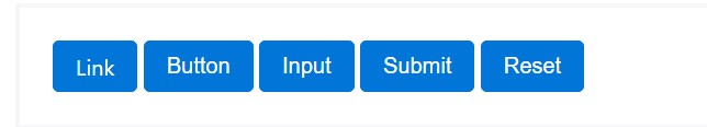
<a class="btn btn-primary" href="#" role="button">Link</a>
<button class="btn btn-primary" type="submit">Button</button>
<input class="btn btn-primary" type="button" value="Input">
<input class="btn btn-primary" type="submit" value="Submit">
<input class="btn btn-primary" type="reset" value="Reset">
These are however the half of the possible appearances you can add to your buttons in Bootstrap 4 since the new version of the framework also gives us a brand new subtle and appealing way to style our buttons keeping the semantic we already have – the outline mode.
The outline setting
The solid background with no border gets replaced by just an outline with some text inside in the corresponding color. Refining the classes is really easy – just add outline before assigning the right semantics like:
Outlined Primary button comes to be .btn-outline-primary
Outlined Secondary - .btn-outline-secondary and so on.
Important thing to note here is there is no such thing as outlined link button so the outlined buttons are actually six, not seven.
Remove and replace the default modifier classes with the .btn-outline-* ones to take out all of the background pictures and color tones on each button.
<button type="button" class="btn btn-outline-primary">Primary</button>
<button type="button" class="btn btn-outline-secondary">Secondary</button>
<button type="button" class="btn btn-outline-success">Success</button>
<button type="button" class="btn btn-outline-info">Info</button>
<button type="button" class="btn btn-outline-warning">Warning</button>
<button type="button" class="btn btn-outline-danger">Danger</button>
Special text
Nevertheless the semantic button classes and outlined appearances are really great it is important to remember some of the page’s visitors won’t actually be able to see them so if you do have some a bit more special meaning you would like to add to your buttons – make sure along with the visual means you also add a few words describing this to the screen readers hiding them from the page with the .sr-only class so really anyone could get the impression you’re after.
Buttons scale
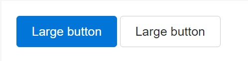
As we said before the new version of the framework aims for legibility and ease so when it comes to button sizes along with the default button size which needs no extra class to be assigned we also have the large .btn-lg and small .btn-sm sizes but no extra small option since these are far too hard to aim with your finger – the .btn-xs from the previous version has been dropped. Of course we still have the convenient block level button element .btn-block spanning the whole width of the element it has been placed within which combined with the large size comes to be the perfect call to action when you need it.
<button type="button" class="btn btn-primary btn-lg">Large button</button>
<button type="button" class="btn btn-secondary btn-lg">Large button</button>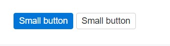
<button type="button" class="btn btn-primary btn-sm">Small button</button>
<button type="button" class="btn btn-secondary btn-sm">Small button</button>
Set up block level buttons - those that span the full width of a parent - by adding .btn-block.
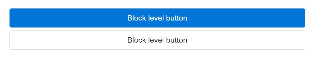
<button type="button" class="btn btn-primary btn-lg btn-block">Block level button</button>
<button type="button" class="btn btn-secondary btn-lg btn-block">Block level button</button>
Active setting
Buttons can seem pressed (with a darker background, darker border, and inset shadow) while active. There's absolutely no need to add a class to <button>-s as they work with a pseudo-class. Although, you are able to still force the same active look with .active (and include the aria-pressed="true" attribute) should you need to replicate the state programmatically.
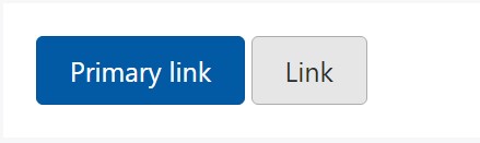
<a href="#" class="btn btn-primary btn-lg active" role="button" aria-pressed="true">Primary link</a>
<a href="#" class="btn btn-secondary btn-lg active" role="button" aria-pressed="true">Link</a>
Disabled mechanism
Make buttons looking non-active by simply providing the disabled boolean attribute to any <button> element.
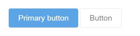
<button type="button" class="btn btn-lg btn-primary" disabled>Primary button</button>
<button type="button" class="btn btn-secondary btn-lg" disabled>Button</button>
Disabled buttons putting into action the <a> element act a little different:
- <a>-s don't support the disabled feature, in this degree you need to include the .disabled class to get it visually appear disabled.
- Some future-friendly styles are involved to turn off each of the pointer-events on anchor buttons. In browsers which support that property, you will not find the disabled cursor anyway.
- Disabled buttons must provide the aria-disabled="true" attribute to reveal the condition of the element to assistive technologies.
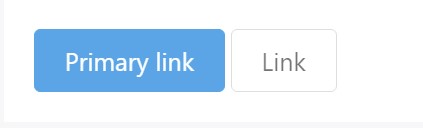
<a href="#" class="btn btn-primary btn-lg disabled" role="button" aria-disabled="true">Primary link</a>
<a href="#" class="btn btn-secondary btn-lg disabled" role="button" aria-disabled="true">Link</a>
Link capabilities caution
In addition, even in browsers that do support pointer-events: none, keyboard navigation remains unaffected, meaning that sighted keyboard users and users of assistive technologies will still be able to activate these links.
Toggle element
Put data-toggle="button" to toggle a button's active state. In case that you're pre-toggling a button, you need to manually include the active class and aria-pressed="true" to the <button>

<button type="button" class="btn btn-primary" data-toggle="button" aria-pressed="false" autocomplete="off">
  Single toggle
</button>
A bit more buttons: checkbox and also radio
The reviewed status for all these buttons is only improved via click event on the button. If you put into action one more method to update the input - e.g., with <input type="reset"> or simply by manually applying the input's checked property - you'll have to toggle .active on the <label> by hand.
Note that pre-checked buttons demand you to manually add in the .active class to the input's <label>.
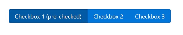
<div class="btn-group" data-toggle="buttons">
  <label class="btn btn-primary active">
    <input type="checkbox" checked autocomplete="off"> Checkbox 1 (pre-checked)
  </label>
  <label class="btn btn-primary">
    <input type="checkbox" autocomplete="off"> Checkbox 2
  </label>
  <label class="btn btn-primary">
    <input type="checkbox" autocomplete="off"> Checkbox 3
  </label>
</div>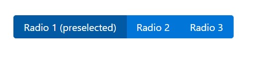
<div class="btn-group" data-toggle="buttons">
  <label class="btn btn-primary active">
    <input type="radio" name="options" id="option1" autocomplete="off" checked> Radio 1 (preselected)
  </label>
  <label class="btn btn-primary">
    <input type="radio" name="options" id="option2" autocomplete="off"> Radio 2
  </label>
  <label class="btn btn-primary">
    <input type="radio" name="options" id="option3" autocomplete="off"> Radio 3
  </label>
</div>
Techniques
$().button('toggle') - toggles push status. Provides the button the looks that it has been turned on.
Conclusions
So generally in the new version of the most popular mobile first framework the buttons evolved aiming to become more legible, more friendly and easy to use on smaller screen and much more powerful in expressive means with the brand new outlined appearance. Now all they need is to be placed in your next great page.
Inspect a few online video short training relating to Bootstrap buttons
Linked topics:
Bootstrap buttons: official documentation
W3schools:Bootstrap buttons tutorial
Bootstrap Toggle button
Best Free AI Website Builder
Generate AI websites with a simple prompt!
Type in any language, export in zip.
Best Free Website Builder Software
Create awesome websites offline!
No coding. 9900+ templates.
Edit and save locally, upload wherever.
Free website builder download for Win, Mac, Linux!
Best Website Templates
HTML Business Templates
Web Design HTML Templates
HTML eCommerce Website Template
Hotel HTML Template
Landing Page HTML Template
Premium Design HTML Themes
HTML Resume Template
Online Shopping HTML Template
HTML Responsive Templates
Latest Posts
- 15 Best AI Website Creators and Generators - Generate your website instantly with AI.
- AI website creator and generator - how to create a website with AI in just 2 minutes.
- Best Free AI website generator and builder - create a website design with AI.
- Best Website Builder AIBest Free AI Website Builder - Create Website Design with AI
- Best Website Builder for Consultants, Magazines, Churches, Authors
- Best Website Builder for Designers, Videos, Education, Software Companies
- Website Builder for Beginners, Bloggers, Writers, IT Companies
- Best Website Builder for Restaurants, Online Stores, Real Estate, Musicians
- Best Website Builder for podcasts and affiliate marketing
- Therapists and nonprofits Website Builder
- Portfolio and SEO Website Builder
- Website Builder for Kids and Musicians
- Website Builder for Photographers and Artists
- HTML Code Generator - HTML Code Creator
- Web Design Program - Website Design Tool
- Landing Page Generator - Landing Page Builder
- No Coding Website Builder - Website Builder For Small Business
- Innovative HTML Builder Drag And Drop Free for Your Next Project
- Is There A Completely Free QR Code Generator
- Extremely Comfortable Business Website Constructor Review
- Bootstrap Select
- Bootstrap Panel
- Bootstrap Tabs
- Bootstrap Toggle
- Bootstrap Modal Popup
- Bootstrap Row
- Bootstrap Multiselect
- Bootstrap Media queries
- Bootstrap Login Forms
- Bootstrap Layout
- Bootstrap Jumbotron
- Bootstrap Button Group
- Bootstrap Breakpoints
- Bootstrap Navbar
- Bootstrap Tooltip
- Bootstrap Textarea
- Bootstrap Switch
- Bootstrap Slider
- Bootstrap Progress Bar
- Bootstrap Label
- Bootstrap Header
- Bootstrap Clearfix
- Bootstrap Sidebar
- Bootstrap Radio
- Bootstrap Offset
- Bootstrap Menu
- Bootstrap Columns
- Bootstrap Checkbox
- Bootstrap Accordion
- Bootstrap Image
- Bootstrap Grid
- Bootstrap Form
- Bootstrap Glyphicons
- Bootstrap List
- Bootstrap Carousel
- Bootstrap Icons
- Bootstrap Collapse
- Bootstrap Popover
- Bootstrap Input
- Bootstrap Modal
- Bootstrap Pagination
- Bootstrap Alert
- Bootstrap Table